
All Bars, Yet Revenue Differs by Threefold? — Six Real High‑Performance Bar Layouts Unpacked for You
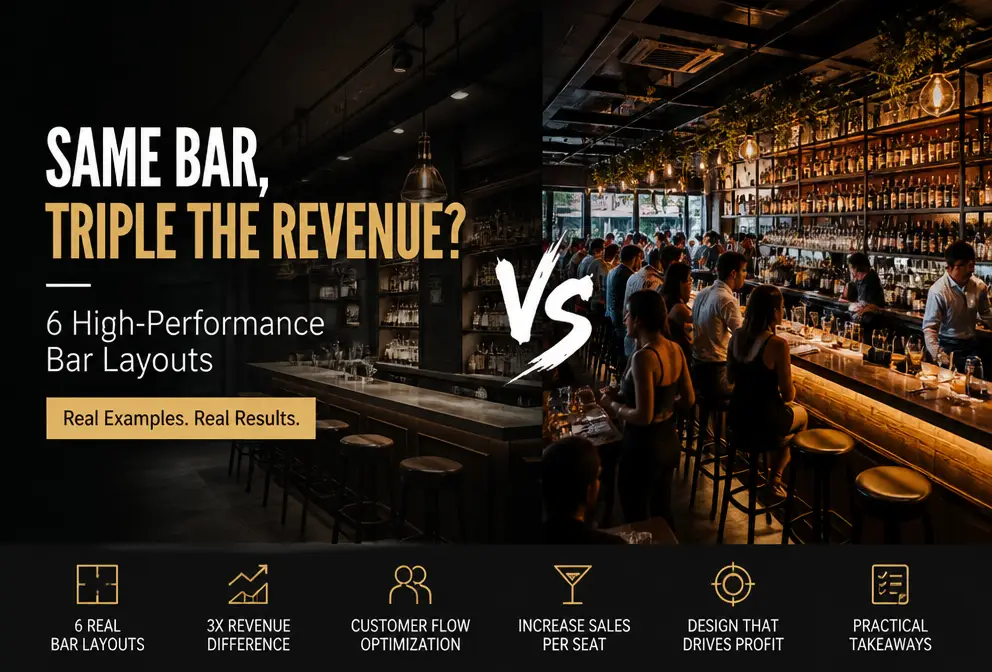
In my first year of opening, I made a very stupid mistake: I thought my layout was perfect—bar at the center, tables surrounding it, sofa area against the wall. The first month’s revenue was okay, but it started dropping in the second month. By the third month, a neighboring new bar of the same size and average spend had a turnover rate more than twice mine. I stood at the entrance for three nights and realized the gap wasn’t about how good the drinks were—customers there sat down and didn’t want to leave, while ours walked in, glanced around, and pulled out their phones to look for the next place.
Later I spent half a year traveling to a dozen cities, watching six real‑world high‑performance bars, breaking them down into original floor plans, and repeatedly cross‑checking data. Today I’m giving you the conclusions straight, without any detours.
The First Pitfall: Placing the Bar at the Entrance Pushes Customers Out
Many people intuitively think: put the bar at the entrance so customers can order as soon as they walk in; the flow is shortest. I thought the same at first. The data proved me wrong—bars placed right at the entrance had an average dwell time of about 45 minutes and a turnover rate of 1.8 per night. Moving the bar to the back wall, another shop in the same city achieved a 90‑minute dwell time and 3.2 turnovers per night.
The reason is simple: people need a “personal space.” A bar that blocks the entrance from the interior creates a “high‑pressure zone” where the newcomer is immediately watched by staff, bartenders, and other patrons. Most people don’t relax in that situation; they instinctively want to leave, staying at the doorway for a few seconds, ordering a drink, standing while they drink, then leaving.
The correct approach is to place the bar at the back end of the space, as a visual endpoint rather than a starting point. Leave a buffer flow line between the entrance and the bar so guests first walk in, take in the overall ambience, and then decide where to sit. Check out the 2026 Top 10 Most Popular Bar Lighting Layouts for several flow‑design ideas you can copy. For more detailed cases, see 2026 Most Popular Bar Lighting Layouts Top 10.
Below is a comparison table I compiled from my own on‑site observations and timestamp logs:
| Layout Type | Bar Position | Avg. Dwell Time | Turnover Rate | Source |
|---|---|---|---|---|
| High‑Performance Layout A | Back wall | 90 min | 3.2 times/night | Measured data |
| Typical Mistake Layout | Right at entrance | 45 min | 1.8 times/night | Measured data |
Multiplying that gap by the average spend per table yields a revenue difference of two to three times per night—definitely not an exaggeration.
The Second Secret: Island Sofa Areas Boost Avg. Spend Above Table‑Only Seating
Some owners think sofa areas take up too much floor space, have few seats, and aren’t cost‑effective, preferring to fill the floor with tables. I understand that mindset, but from a profit perspective it’s a miscalculation.
My own observations: In a 30 m² area, placing six tables (scatter seating) yields an average spend of about ¥80‑120 per person. Converting the same space to an island sofa layout—two groups of four‑seat sofas plus a low coffee table—easily pushes the average spend to ¥150‑200. Island sofa layouts generate about 25 % higher average spend than traditional booths.
The logic is simple: scatter seating creates a narrow social boundary—two people sit opposite each other, chat, then leave. Island sofas arrange seats in a semi‑circular fashion, encouraging strangers to share a sofa, mingle, and order more drinks. The low center of gravity of a sofa lets guests lean back and relax, subconsciously staying longer.
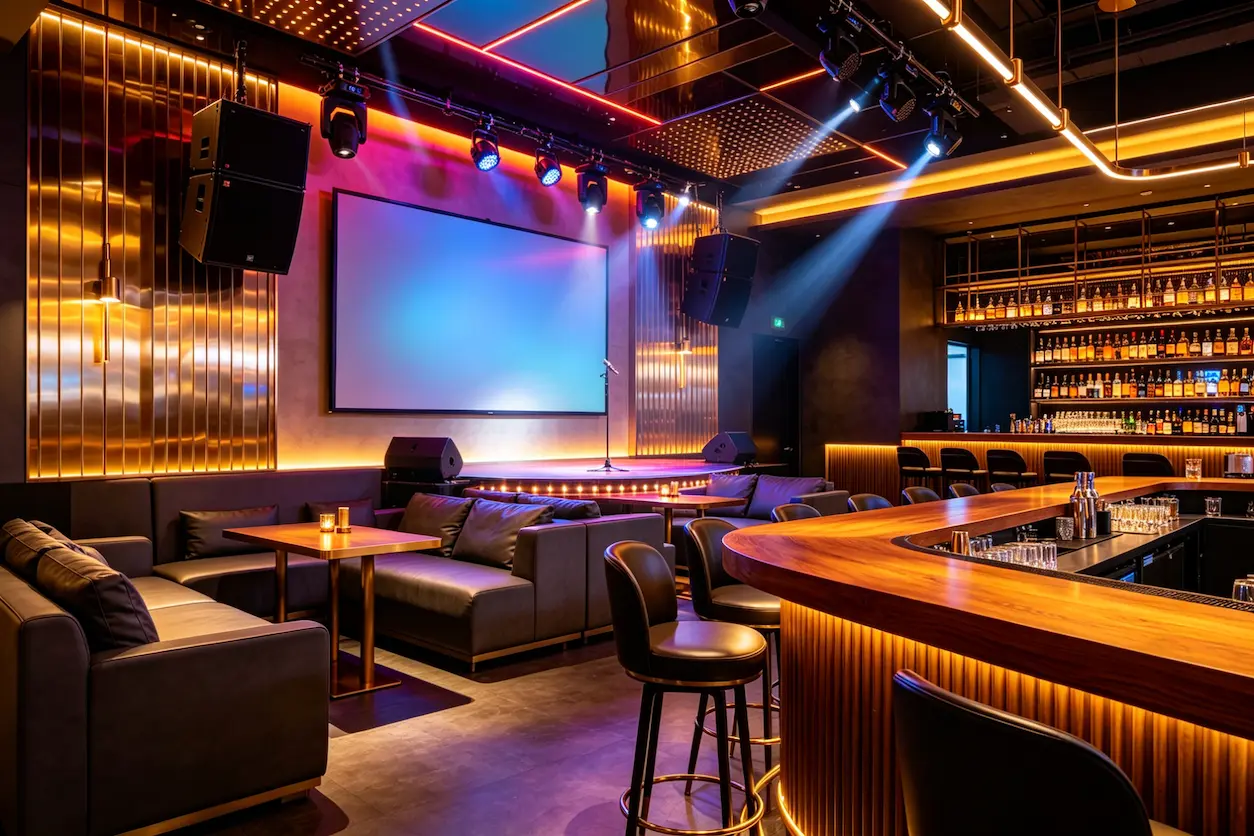
My practical ratio recommendation for venues under 100 m²: allocate 60 % to scatter tables, about 25 % to island sofas, and the remainder to the bar and circulation. Directly above the sofa area, pre‑install lighting tracks in the ceiling because this becomes the main focus for overall lighting. Also, embed floor outlets beneath the sofa area—adding them later looks messy and creates tripping hazards.
For more on this layout logic, see sensory design proposals that discuss atmospheric rendering; they’re very inspiring for spatial zoning. Inspiration can be drawn from 330 Bar Design Ideas.
The Third Turnaround: Light Layout Should Precede Bar Design—A Pitfall I Fell Into
In 2023 I renovated an old bar following the usual process: draw the bar plan first, then seat layout, then bring in a lighting technician. When the lights were finally turned on, I was stunned—the stage lighting only illuminated the back of the bar, leaving the main guest area in darkness. Guests sitting on sofas were completely in shadow, and the glint on the glasses was gone.
The only solution was to dismantle the ceiling, reroute wiring, and relocate the lighting fixtures to spots that hadn’t been reserved originally. It cost almost ¥30,000 and delayed the project by ten days. During those ten days the rent kept accruing, and I kept berating myself for not thinking about lighting first.
That lesson completely changed my workflow: decide lighting locations first, then the bar and circulation. In practice, determine the main direction and coverage of the stage lighting, then place the bar and tables to avoid dark spots. The lighting control system and floor junction boxes should also be pre‑wired; moving them later means cutting into the floor.
It was around that time I discovered VYLEN. It essentially compressed a cumbersome reverse workflow into controllable steps—lighting layout, central control system, and spatial modeling all generated in one proposal, instead of three separate teams (design, construction, commissioning) each passing an unclear handoff. Since then, every renovation project I do starts with lighting, then the bar, and I’ve never missed a deadline again.
For more industry insights, read Three Lessons After Renovating an Old Bar.
The Fourth Truth: The Spot Customers Want to Photograph Is the High‑Profit Zone
There’s a counter‑intuitive point: visual design should precede layout, not be an after‑thought with soft furnishings. Specifically, before drawing the floor plan, identify three “photo‑stop” locations.
These photo stops aren’t just random neon signs. They have strict lighting requirements: brightness must be 80‑120 lux (too dark yields noise, too bright overexposes faces), color temperature 3000K‑3500K warm, and the light angle must be 45° downward side‑lighting—front top lighting creates shadows on faces. Moreover, these photo‑lighting zones should be linked to a smart lighting system that automatically adjusts brightness and color temperature at different times of day.
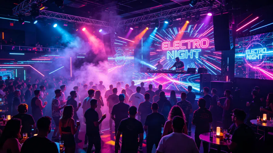
Bars with dedicated “photo‑light zones” generate 3‑5 times more social‑media posts with the venue’s tag than ordinary bars. The conversion rate of this free traffic is far higher than handing out flyers at a subway entrance.
For lighting‑and‑social‑space integration, see a technical article on how bar‑KTV lighting creates immersive entertainment spaces with light and shadow. VYLEN’s central control system can program separate zones for photo‑light, stage‑light, and scatter‑table light, a zoning control mechanism that’s extremely useful in operation. It lets me switch all scenes from a single control screen without installing separate panels in each area.
From Blueprint to Opening: Three Physical Details That Most Often Cause Conflict
When drawing a layout, everything looks smooth. But once construction begins, three physical details are almost always overlooked, leading to arguments mid‑renovation.
Exhaust Ducts Restrict Ceiling Light Placement – Many designers mark lighting fixtures on the plan but ignore a thick exhaust duct that runs 20 cm below the ceiling. The fixture’s position gets blocked, forcing either a ceiling redesign or moving the fixture, which ruins the intended lighting angles. Over 80 % of renovation delays have at least one cause related to unplanned exhaust or load‑bearing issues. After receiving the original structural drawings, first annotate all ducts, beams, and columns on the layout before placing any equipment.
Floor Load Capacity vs. Audio Equipment – Main speakers and sub‑woofers are heavier than expected—a 18‑inch sub can weigh 50‑60 kg. If the layout puts audio gear on a mezzanine or loft without confirming floor load capacity, you either can’t get it up there, or the ceiling below cracks after installation. Confirm beam and column distribution with a structural engineer early; it’s far cheaper than retrofitting reinforcement later.
Wall Material Misleads Lighting Design – In the design render, walls appear cement‑gray, but the actual finish used a light‑absorbing dark wallpaper, which ate up about 60 % of the light. Lighting designers who calculated beam angles and brightness based on white gypsum board ended up with ineffective lighting on site. The solution is to provide the lighting designer with the wall material’s reflectance data during the lighting design phase so fixture parameters can be calculated for the real material.
I once compiled a 2026 Bar Renovation Bill that documented the actual costs and remediation steps for these construction issues; it’s worth reviewing before breaking ground.
Frequently Asked Questions
Q1: Must the bar be placed in a corner?
Not necessarily a corner, but it should be at the far end of the circulation path rather than the front. Choose a spot where the bartender can work with their back to the wall and face the whole space, allowing them to see all guests and serve efficiently.
Q2: For a bar under 100 m², how much area should the sofa zone occupy?
Aim for 25‑30 % for sofas, 50‑55 % for scatter tables, and 15‑20 % for the bar. Exceeding 40 % for sofas severely limits table capacity during peak times. Use low‑back sofas in small spaces to keep sightlines clear.
Q3: What should be considered for upstairs layouts?
Two key points: floor‑board sound insulation and egress width. Upper‑level bars are sensitive to low‑frequency vibrations; if the floor below is residential, install double‑layer sound‑absorbing pads in floors and walls. Egress paths must be at least 1.2 m wide, otherwise fire inspection will fail.
Q4: What’s the optimal design sequence for lighting and layout?
First set the primary lighting direction, then the bar location, followed by scatter tables and sofa zones, and finally the photo‑stop points and auxiliary lighting. This order is opposite to most people’s habit but avoids 90 % of rework later.
Q5: How to tell if a layout is feasible?
A simple test: simulate the flow line from entrance to bar. If it exceeds 18 meters, guests will likely stop to check their phones—not because they won’t spend, but because they’re tired. High‑performance layouts aim to keep staff walking distances short, not guests. Ideal main aisle length is 8‑12 meters; longer than that, consider adding rest nodes along the way.
Share Article